Ecommerce Website Conversion Optimization Tips
A store can attract the right traffic and still leave money on the table. That usually happens when the path from product page to purchase feels slow, unclear, or risky. Ecommerce website conversion optimization is the work of removing that friction so more visitors become customers without wasting more budget on traffic that never converts.
For growing businesses, this matters because conversion rate affects everything else. It changes how hard your ads have to work, how profitable your SEO becomes, and how much revenue your current audience can produce. If your store gets 10,000 visits a month, even a modest lift in conversion rate can outperform a much larger media spend.
What ecommerce website conversion optimization really means
A lot of teams treat conversion optimization like button-color testing. That is a narrow view, and usually the wrong place to start. Real ecommerce website conversion optimization is about reducing hesitation across the full buying journey. That includes load time, mobile usability, product clarity, trust signals, accessibility, checkout flow, and the quality of the traffic you bring in.
The key is to stop asking, “How do we get more clicks?” and start asking, “What is making qualified shoppers pause?” Sometimes the issue is obvious, like a clunky checkout. Sometimes it is subtler, like weak product photography, vague return information, or a mobile menu that forces users to hunt for basic categories.
There is also a business reality many stores ignore: not every conversion problem is a design problem. Pricing, shipping costs, inventory visibility, and offer structure have a direct impact on performance. If visitors abandon once they see shipping fees, no amount of visual polish will fully solve it.
Start where revenue is already leaking
Before making changes, look at the places where intent is strongest. Product pages, cart pages, and checkout deserve attention before your homepage gets a full redesign. A homepage might help orientation, but most buyers make their decision deeper in the funnel.
Product pages should answer the practical questions buyers ask before they commit. Is this the right size? What does it look like from multiple angles? When will it arrive? Can it be returned easily? If those answers are buried, unclear, or missing, conversion drops.
Cart and checkout pages need a different lens. Here, the shopper has already signaled intent. At this point, friction is expensive. Forced account creation, surprise fees, too many fields, distracting upsells, or a payment method mismatch can all cause abandonment fast.
If your analytics show heavy drop-off on mobile, take that seriously. Many ecommerce brands still review their store on desktop and assume the experience translates. It often does not. Thumb reach, field entry, sticky call-to-action placement, and page speed all hit harder on smaller screens.
Speed and performance are conversion factors, not technical extras
When a store feels slow, trust erodes. Shoppers may not say, “This site has poor performance,” but they will leave. They will bounce before a hero image loads, abandon when product variants lag, or give up during checkout if fields take too long to respond.
Performance improvements often create some of the fastest gains in ecommerce website conversion optimization because they affect every visitor. Compressing oversized images, reducing script bloat, improving hosting, and cleaning up third-party app load can make a measurable difference.
There is a trade-off here. Many stores add plugins, popups, review widgets, personalization tools, and tracking scripts with good intentions. Each one may promise growth. Together, they can slow the experience and weaken the very conversions they were meant to improve. More functionality is not always more effective.
Trust has to be built before the cart
Shoppers are constantly scanning for reasons to believe or hesitate. If your site looks polished but feels vague, hesitation wins. Strong trust signals should appear where people are making decisions, not hidden in the footer.
That means clear shipping information, visible return policies, accurate inventory messaging, product reviews, secure payment cues, and honest product descriptions. It also means showing your business like a real business. Contact details, FAQ support, brand consistency, and clean design all reinforce legitimacy.
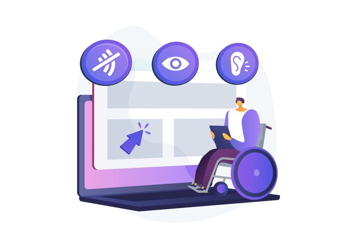
Accessibility plays a role here too. A store that is easier to navigate, easier to read, and easier to use for more people is not only more compliant – it often converts better. Better contrast, clearer labels, keyboard-friendly navigation, and readable forms reduce friction for everyone, not just users with disabilities.
Product pages should sell with clarity, not noise
Many product pages try to compensate for weak fundamentals with visual clutter. More badges, more popups, more sliders, more tabs. Usually that creates decision fatigue.
A high-converting product page gives shoppers confidence quickly. The product title should be clear. Imagery should show the item in context and in detail. The value proposition should be visible without forcing a scroll. Pricing should be straightforward. Variant selection should be easy to understand. Delivery expectations should be realistic and easy to find.
This is also where message hierarchy matters. Buyers do not all need the same information at the same time. Lead with what drives the purchase decision, then support it with specs, reviews, and policies. If every element screams for attention, none of them do their job well.
Checkout optimization is often the highest-impact fix
If you want the shortest path to revenue growth, review your checkout. This is where strong buying intent meets avoidable friction.
Guest checkout is usually the safer default. Some brands benefit from account creation, especially if reorder frequency is high, but forcing it too early can cost sales. Keep form fields lean, support autofill, and offer the payment methods your customers already trust.
Transparency matters at this stage. If shipping, taxes, or delivery dates are unclear until the final step, drop-off is likely. The same goes for coupon code fields that create doubt. A visible promo box can make shoppers feel they are missing a better deal. Whether to show it depends on your promotional strategy and customer behavior.
Cart recovery tools can help, but they should not become an excuse for a weak checkout. Recovery emails and retargeting are useful. Fixing the reason people abandon is better.
Good optimization depends on better data
Guesswork is expensive. The strongest conversion gains come from combining analytics with direct user signals. Look at funnel reports, device splits, page speed data, and abandonment points. Then pair that with heatmaps, session recordings, customer service feedback, and actual buyer questions.
Patterns matter more than isolated opinions. One customer saying your checkout is confusing is worth noting. Fifty sessions showing users rage-clicking a shipping estimator is a priority.
It also helps to separate macro and micro conversions. Purchases are the main goal, but add-to-cart rate, checkout starts, email signups, and product page engagement can show where the journey weakens. If traffic reaches product pages but few add to cart, your product presentation or offer may be the issue. If many add to cart but few finish checkout, your friction is later in the funnel.
Testing works best when the fundamentals are already strong
A/B testing has value, but it is often overused before the basics are fixed. Testing two headlines will not overcome poor load speed, weak trust signals, or a broken mobile cart.
Once the foundation is solid, testing becomes more useful. Then you can evaluate meaningful changes such as product page layout, image order, add-to-cart button placement, shipping message language, or checkout field flow. The best tests are tied to a real hypothesis, not curiosity alone.
It is also worth being honest about traffic volume. Smaller stores may not have enough sessions to reach confident test results quickly. In those cases, heuristic improvements based on user behavior and proven ecommerce patterns often produce better returns than endless low-volume experiments.
The best conversion strategy is cross-functional
Conversion optimization is not just a designer’s task or a marketer’s task. It touches development, UX, content, accessibility, analytics, and growth strategy. That is why piecemeal fixes often stall. One team improves the ad creative while another adds heavy scripts, and someone else ignores checkout friction. The result is a store that looks active but performs unevenly.
The stronger approach is coordinated. Improve performance, simplify the path to purchase, sharpen product messaging, and validate changes against revenue data. That is where bespoke execution matters. A Shopify or WooCommerce store does not need generic best practices pasted on top. It needs improvements shaped around the actual customers, offer, and technical setup.
For businesses that want measurable growth, ecommerce website conversion optimization should be treated like an ongoing revenue program, not a one-time cleanup project. Stores change, customer expectations change, and what worked last year may quietly underperform now.
A better store does not always need more traffic. Sometimes it just needs fewer reasons for people to leave.