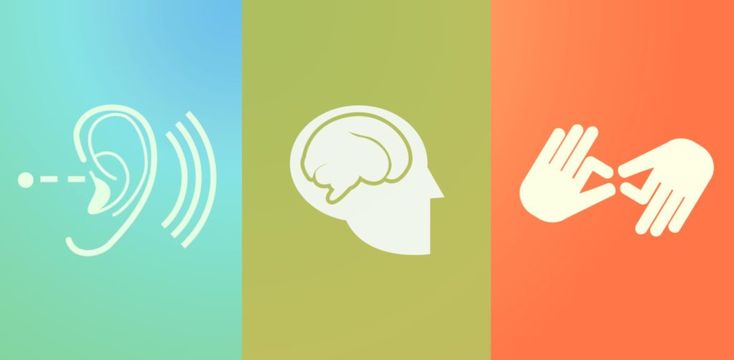
Understanding Web Accessibility: A Core Value
In an increasingly digital world, ensuring that everyone can access online content is more important than ever. Web accessibility is about designing websites so that people with varying abilities can use them effectively and comfortably. This blog post delves into both good and bad practices related to web accessibility while offering insight into how these practices impact individuals and communities.
Understanding Web Accessibility: A Core Value
Web accessibility is not just a technical requirement; it embodies strong ethical values inherent in creating an inclusive and empowering digital environment. It reflects a commitment to community service, ensuring that everyone, regardless of their abilities, can participate fully in the digital landscape. By prioritizing accessibility, we send a message that compassion and kindness transcend mere compliance; they embody a spirit of determination and inclusivity.
When we enhance web accessibility, we open the door for diverse voices and capabilities in technology and digital communications. The practice of embracing web accessibility aligns seamlessly with the values-driven messaging we want to promote. Thus, it becomes essential to understand not only what constitutes good practices but also to recognize the missteps that lead to poor accessibility.
Bad Example #1: Ignoring Alt Text for Images
One fundamentally bad practice of web accessibility is neglecting to provide alternative text (alt text) for images. Alt text serves as a text-based description of images, allowing screen readers to convey visual content to users with visual impairments. When images are posted without alt text, these individuals miss out on crucial context and information, often leading to frustration. Quite frankly, this negligence demonstrates a lack of consideration for a segment of our audience.
Furthermore, the absence of alt text is not just an oversight; it perpetuates the digital divide. Aspiring professionals, students, and entrepreneurs struggling to engage with valuable content find barriers that could have easily been removed. Applying this simple practice can foster an environment where all users comprehend and enjoy the same digital experiences.
Bad Example #2: Complex Navigation
Another glaring issue regarding web accessibility lies in complicated navigation structures. Websites that bury crucial information deep within convoluted menus create stumbling blocks for users with cognitive disabilities or those who may not be familiar with digital navigation. If users find it challenging to locate what they need, frustration can mount, leading to abandonment of the site, or worse, mistrust in the brand itself.
A friendly and accessible navigation structure should be streamlined and intuitive. By valuing simplicity, we reflect an understanding of our audience’s needs. When considering your audience — be they aspiring tech professionals or families seeking guidance — crafting an easy-to-navigate website builds confidence and fosters a sense of belonging.
Bad Example #3: Inaccessible Forms
Forms are ubiquitous in the online landscape, whether for boosting newsletter sign-ups or facilitating customer inquiries. However, when web forms are poorly designed, they become barriers rather than bridges. For example, inaccessible forms may lack proper labeling, making it challenging for users with screen readers to complete their actions.
This lack of attention to detail can evoke feelings of exclusion among individuals who rely on assistive technologies. User experience becomes less about facilitating connections and more about disheartening users. Breaching this barrier matters critically because many entrepreneurs and individuals in tech fields are seeking growth opportunities that often hinge on filling out these very forms.
Bad Example #4: Using Color as the Sole Means of Communication
Using color as the sole means of conveying information leads to accessibility pitfalls that can alienate individuals with visual impairments or color blindness. For instance, relying on color to denote error messages in forms without alternative indicators leaves many users in the dark. Not everyone perceives colors in the same way, and using color alone is insufficient.
To create an inviting and accessible framework, it’s essential to incorporate multiple cues, such as icons, shapes, or text, to convey critical information. Doing so enhances the inclusivity of your website, making it a place where everyone can thrive. After all, the backbone of an accessible website should focus on bringing people together, not separating them.
Bad Example #5: Overlooking Keyboard Accessibility
Keyboard accessibility is another area rife with challenges. Websites requiring mouse navigation can isolate users who depend solely on keyboard navigation due to disabilities. For example, if users cannot tab through navigation elements, they may find themselves unable to interact with various aspects of your site.
Promoting inclusivity means ensuring that all elements are reachable through keyboard controls. This small adjustment can drastically improve user experience for a sizable population of tech-savvy individuals and aspiring professionals. Accessibility is everyone’s responsibility; thus, it is essential to take these concerns seriously.
Good Practices: Building an Inclusive Digital Space
To foster an environment where web accessibility thrives, we must actively embrace good practices. Celebrating this commitment means using proper alt text for images, offering accessible forms, and ensuring keyboard navigation is seamless. Such actions reflect a professional approach infused with a personal touch — an integral part of our mission.
Additionally, when crafting content, maintain a conversational tone that resonates with a broad audience. By utilizing clear language and thoughtful terminology from technology, leadership, and community service, the message becomes inclusive, supportive, and accessible.
Conclusion: Taking Action for a More Accessible Future
Web accessibility goes beyond mere regulatory compliance; it’s about extending kindness and friendliness towards our audience. As we acknowledge bad practices, we must reinforce good ones, aligning with our core values and the spirit of community service. Every step taken towards improving accessibility contributes to a more inclusive society, where all individuals can engage with the vast expanse of the digital world.
By cultivating a sense of belonging, we inspire action and confidence in our audience. Together, let’s build a space that embodies determination and enthusiasm—a digital community where everyone has the opportunity to learn and grow.


